- the front cover to a magazine for the series
- a DVD cover for the series
- Price
- Product
- Place
- Promotion
Before thinking about my own style guides I had to do a deep amount of research into it and learn how big TV dramas like Doctor Who create a style guide that will be recognised almost anywhere. Below is a link to the survivors website which I think is a strong example of using an appropriate style guide that's links to its key conventions:
http://www.bbc.co.uk/programmes/b00q3gk5
Straight away I can see what features are used in the graphic design and the opening sequence to create a style guide:
- Low diagetic sounds
- Doesn't give to much away about the plot
- The "virus" font
- Exploring narrative in opening sequence
- White space
I then created my own style guide which had 5 rules based on my main media text and must apply to any ancillary text created.
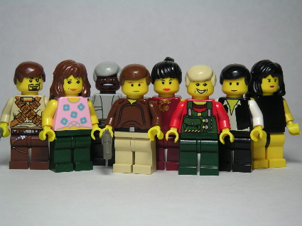
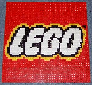
Here are a few images that are very important as part of my house style:


The 5 most important rules of my style guide are:
- The LEGO style font or colours must be shown on any ancillary text produced- as this is what would catch the target audiences eye and would be what they expect to see as it is strongly linked to my main media product.
- The main character Jordan must be shown- this is important and Jordan is the brand image of my main media product and it is vital he is shown to illustrate to the target audience that "this is a Changes product".
- Bold bright colours must be used- as in my media product this was illustrate clearly through the Lego itself and and is a strong convention in my work.
- Representation of good and evil must be shown in some sort of context- this is important as I have followed the "Spheres of action" very strongly and as it sends out messages to audiences I think its important I show this in any ancillary text.
- The idea of "mixed worlds" (Lego and real)- this isn't as important as the other 4 rules but the overall effect of my main media product is the idea of mixing to completely different genres together to create an engaging effect on the audience. So I think this idea should be shown in any form of context to represent "Changes"
Using these rules I created the magazine cover and the DVD cover. Looking at the ancillary texts you can see that I applied all my style guide rules in one way or another and from this I believe I created a very coherent package. I used my style guide to combine my main media product and my ancillary texts in a effective through the media language-images,styles,fonts,mode of address,linguistic styles etc.
After carrying out questionnaires on my target audience and showing them my main media product and my ancillary texts I got a lot of interesting and effective feedback. Even tho my target audience are very young and don't understand what coherence is, they could clearly see the combination in all my work and when I asked why they replied with short simple answers like "There's Lego in each one" and "the boy is in everyone". All the feedback I got linked to my style guide and if my target audience could clearly see the links between all texts in my work than its shows I have a strong positive house style that's branding all my work under one roof "Changes". I cannot use my audiences opinions as a "fact" but after putting a lot of planning into my style guide and with the target audience understanding it visually and mentally I believe I have produced a house style that has created an effective combination between my main media product and my ancillary texts.
The links below helped me when researching and planning not just for this question but for my coursework as a whole:
http://en.wikipedia.org/wiki/style_guide
http://www.eyeon-newmedia.co.za/pages/style.html
http://en.wikipedia.org/wiki/brand


No comments:
Post a Comment