Friday 19 February 2010

Question 1- In what ways does your media product use, develop or challenge forms and conventions of real media products?

Creativity, Conventions and Entropy

Firstly, before I talk about my media product, take a look at this link I found on Youtube:

http://watch.youtube.com/watch?v=XaGh0D2NXCA&feature=PlayList&p=C3F64DE53C8F8AD2&index=6

From this link you can see that the text challenges forms and conventions of real 'media' products through:

  • Lack of narrative structure
  • Doesn't use continuity editing
  • No recognisable generic conventions
  • No Spheres of action
  • Doesn't have conventional cinematography
  • Very entropic, high degree of unexpectedness

The overall effect of this text is to put an unexpected effect on the audience, I thought very Carefully about this before making my media product and came to the conclusion I wanted to incorporate similar ideas and functions into my own text. I didn't want to be completely entropic as it would have a major effect on the target audience because they are so young and wouldn't understand my text. However I wanted to use a certain degree of entropy as I wanted to get the audience thinking about my media product and how it was unexpected. (Watch my directors commentary to find out how I created a balance of entropy and redundancy suitable for the target audience)

Now looking at a totally different playing field look at these too links, the first one being a Youtube clip I found and the second one a video of a butterfly I filmed when experimenting with entropic and redundant texts:

http://www.youtube.com/watch?v=ee3iuhJaA6A

The two clips are redundant, they are conventional and very typical. There is nothing 'unexpected' about them. The reason the first Youtube clip is so redundant is for one reason; making money.

It was very important for me to use redundancy in my media product as I wanted the largest target audience possible and to do that I had to stick to the 'rules' e.g. using Spheres of action. Also my media product was being made to be taken on by the BBC-CBBC which is very mainstream so it was important I used large degree of redundancy.

Creativity

I believe my media product is full of creativity, before even starting my Children's TV Drama I spent hours searching the web like Youtube, Lego links and real Children's TV dramas to make sure I wasn't going to be reworking an old idea as I wanted my work to be fresh and new so my target audience could see something never done before.

My ideas and framework for my AS coursework were very mainstream as I wanted to "play safe" so I could attract a large audience. However this year with mainstream still in mind I wanted to be a little more creative and experiment by mixing redundant and entropic ideas together; I know this can cause problems like my audience not being able to understand the text but I wanted to take the risk to see If I could create something successful from mainstream-niche ideas.

Technology helped my achieve creative goals as we wouldn't of been able to use Lego "Stop Frame Animation" if we didn't have the SLR cameras. They have played a huge part in this years coursework as with out them I wouldn't have been able to explore and achieve Stop Frame Animation and apply it with NVGS27 video cameras. Also last year there was a lack of communication with my AS work for feedback as I didn't have social networking sites like facebook. However this year technology has enabled me to use sites like facebook to communicate to friends about research,planning and ideas which allowed me to gain feedback so I could mould my work around their positive and negative comments and create audio commentary's on feedback which I've never done before.

Throughout creating my media product I never experienced whats known as "writers block" as I kept changing my ideas all the time to stay fresh and creative, I don't believe you can create a piece of work without changing it during the process. I had to stay focused and somewhat laid back on my ideas as I didn't want to get to attached to just one, I kept building on my work all the time until I was satisfied with the outcome.

I spent weeks before I knew what I wanted to do, I was always experimenting with ideas and getting feedback while other members of the group were already deep into their coursework but I knew I had to keep my mind wide open as that was the best option to take if I wanted to create a media text I had put all of my potential into. I had to know exactly what I was doing before I went on to actually do it that's why I think all the time I put into experimenting and using different creative ideas was the best way forward.

For the first time ever I moulded my work around my life outside college. I never knew how much ideas I could get through the simplest things in my social life for example my little brother who's 11 watches Children's TV Dramas and I was able to watch his reactions to different types of shows and ask him questions about them which helped me hugely when trying to appeal to my target audience. Being a football coach means I have to always change my teams tactics all the time to defeat the opponents and for the first time I used this technique to be creative and incorporate it in my work. Every week I would plan and change my ideas to overcome obstacles up ahead which worked and made me more aware and prepared for what I could and couldn't do.

Genre

Generic conventions are used in media texts all the time and I wanted to challenge some of the typical generic conventions. However I knew challenging generic conventions is sometimes pleasurable and sometimes problematic but I gambled and went for it. However I was careful in the way that I did this, I researched a theorist called Andrew Tudor and used the idea of building on a certain genre (In my case adventure drama) and creating a new sub genre to be born by mixing two genres together. I mixed a sci-fi action genre (LEGO) with a drama genre to create a totally new sub genre which would challenge generic boundaries. From looking at genre life cycles I would say my work comes under "Epic" as I have added new ideas into genre conventions that already exist and made sure they "fit" into the themes, ideology and values of the original genre.

The links below have helped me throughout the course and enabled me to understand and answer questions like this one:

http://www.mediaknowall.com/alevkeyconcepts/genre.html

http://en.wikipedia.org/wiki/creativity

My Directors Commentary

This is a basic overview of what is said in the directors commentary in a question and answer format:

Where have your ideas come from?

My ideas came from TV dramas like "Life on mars" and "Ashes to ashes" as I liked the idea of the changing of worlds and I found it very interesting and creative the way they constructed the idea of someone entering a new environment in a short title sequence. My ideas also came from Lego animation, after playing with the SLR cameras and watching Lego animation on sites like Youtube I thought it would be a great idea to create Lego animation as one of the two worlds in my work. Also most the ideas I used I came up with myself like the idea of getting lost and trying to find your way back home with the help of friends which I used in my narrative plot.

How different are your products to "real" media products?

With the limited amount of technology we had and on a very tight budget we didn't have the elements of a "real" media product like not creating our own sound effects so we had to get them off websites. However because my media product was created on the computer using professional programmes like photoshop and adobe premiere pro and because Lego is a media conglomerate and I have used it in my work it makes my work a "real" media text.

To what extent have you been original?

I believe I have been very original with my media product as I have taken two totally different genres and not colided them but "merged" them together. The idea of Lego as a TV programme is origianl as it has never been done before and then mixing it with everyday events to create a new sub genre makes it original on a even larger scale which I was aiming to achieve.

To what extent has entropy been used?

Entropy has been used a lot in my media text and it was important for me to use it to create the effect I wanted on the audience. The idea of a Lego superhero being turned into a human school boy is very entropic and keeps the audience unaware of whats going to happen next which creates a overall knock-on-effect of the audience wanting to carry on watching.

To what extent has redundancy been used?

I also used a large amount of redundancy as I didn't wanted the audience to get confused with the media text and therefore not enjoying it. As the target audience is young I had to use a lot of redundancy even tho I didn't want to! As the main character Jordan is turned into a school boy and its obvious that the narrative of the programme will involve a school. Plus I used "Spheres of action" and Toderov's theory of good vs bad to create a "easy" to understand text that the target audience would enjoy. I also used old ideas from other programmes like "My parents are aliens" where two worlds collide so the audience weren't being introduced to a text that is "alien" to them and so they will accept my text as they are familiar with its conventions.

What is the overall effect of using redundancy/entropy on the audience?

To create a media text that will appeal to a large target audience and for the media text to effect the audience in a way that will keep them interested and want to keep watching as they can relate the texts to their own personal life e.g. feeling lost at school like the main character Jordan.

Challenging forms and conventions is possibly dangerous, why?

It can cause the audience to be confused and not understand the text and therefore not enjoy it resulting in a rapid loss of viewers. If the audience don't understand the context of the media product there is no hope for moving forward with the media text. I had to remove certain clips from my media text like the earth poster in the school to illustrate the changing of worlds and a child development book Jordan holds indicating he is changing, however after showing these clips to our target audience they didn't understand them and asked why they were used so I thought It was for the best to remove the clips as I didn't want a confused target audience as they are only young and easily off put by texts they don't understand.

Following forms and conventions is possibly dangerous, why?

Giving the audience a media text that is very similar to other media products is very dangerous as the audience will find the text boring because its so similar and they will feel like they've seen it before therefore they will feel like its the same as everything and will not want to watch something that is so redundant. It was hard for me when creating my media product as I had to use a large amount of redundancy because of the age of the target audience without being to similar to other media products and using a certain amount of entropy to counter act the redundancy but at the same time not create a text that would confuse the target audience.

How were you inspired to do what you did?

I liked the fact I had so much creativity I could use and I used this to my best advantage to create a media product so unique it couldn't be paired to much other media products. I had plenty of ideas on inventing a character my target audience could relate themselves to and I built on this idea by adding Lego animation which is something Ive always been curious on doing. So being able to mix the two together was a bonus for me and I have not just created a media text that has achieved its aims but I have created something Ive always wanted to do and I have really enjoyed producing it.

How did your audience research direct your creativity?

Looking at a very young target audience meant I could be more informal and less mature in my ideas which I found new and interesting. I did a lot of experimenting and research into things Ive never looked at before like Children's TV Dramas. But the best part of being creative to a young target audience is the fact a child sees the world as a weird and wonderful place they want to learn from and explore so with this in mind I could create anything literally-as long as it appealed to them. When researching Lego, when I typed it into google thousands of results came up and as there aimed a young target audience very similar to mine it seemed like the perfect route to go down and with plenty of ideas already I could create a media product that would attract a very large target audience.

How did audience research direct your research into similar texts?

Researching for my target audience made me look at media texts with the same elements as mine like Tracy Beaker. I took ideas from these other Children's TV dramas which I looked at very closely and noticed they all had an effect on the target audience through the gratification approach. So when I was creating by media text I could apply the same ideas to get the same effect on the audience as the other media products did. Using the gratification approach I could make the audience connect with my media product through:

  • Learning-The audience learn about school life and how to cope if its your first year or if your new to that school
  • Escapism- If the audience enjoy school and don't have a stable life outside school they can use my media product to escape from that
  • Social interaction- a very common effect that causes my media product to be a major talking topic at school
  • Identity- Most media texts don't have this effect but I wanted to create a main character that my target audience could relate there own lives to. I tried to do this through making him the same age as the target audience and putting him though school life which every child has to face.

Question 2- How effective is the combination of your main product and ancillary texts?

A selection of materials related to an original children's TV drama, to include the title sequence to the TV programme, together with:

  • the front cover to a magazine for the series

  • a DVD cover for the series
The above is the original brief of what was wanted from me. The idea was to produce a coherent package that had a house style and worked together to attract audiences to the actual product. Overall I was producing a marketing package;

  • Price

  • Product

  • Place

  • Promotion
I didn't know much about style guides before this course but now I've learnt that in order to attract the audience you want you must an appropriate "house style" and that my main media product must link in some way to my ancillary texts to attract the right target audience. I found this very interesting mainly because it is so effective on getting the right audience and follow the genre's conventions just through the usage of graphic design. So it was vital for me to use a style guide that would reel in a large target audience as I was with the BBC and more importantly create a House style that's would strongly link my main media product and my ancillary texts together that people could tell what was under the influence of "Changes" whether it be a magazine cover or DVD.

Before thinking about my own style guides I had to do a deep amount of research into it and learn how big TV dramas like Doctor Who create a style guide that will be recognised almost anywhere. Below is a link to the survivors website which I think is a strong example of using an appropriate style guide that's links to its key conventions:


http://www.bbc.co.uk/programmes/b00q3gk5


Straight away I can see what features are used in the graphic design and the opening sequence to create a style guide:

  • Low diagetic sounds

  • Doesn't give to much away about the plot

  • The "virus" font

  • Exploring narrative in opening sequence

  • White space

I then created my own style guide which had 5 rules based on my main media text and must apply to any ancillary text created.

Here are a few images that are very important as part of my house style:


The 5 most important rules of my style guide are:

  1. The LEGO style font or colours must be shown on any ancillary text produced- as this is what would catch the target audiences eye and would be what they expect to see as it is strongly linked to my main media product.
  2. The main character Jordan must be shown- this is important and Jordan is the brand image of my main media product and it is vital he is shown to illustrate to the target audience that "this is a Changes product".
  3. Bold bright colours must be used- as in my media product this was illustrate clearly through the Lego itself and and is a strong convention in my work.
  4. Representation of good and evil must be shown in some sort of context- this is important as I have followed the "Spheres of action" very strongly and as it sends out messages to audiences I think its important I show this in any ancillary text.
  5. The idea of "mixed worlds" (Lego and real)- this isn't as important as the other 4 rules but the overall effect of my main media product is the idea of mixing to completely different genres together to create an engaging effect on the audience. So I think this idea should be shown in any form of context to represent "Changes"

Using these rules I created the magazine cover and the DVD cover. Looking at the ancillary texts you can see that I applied all my style guide rules in one way or another and from this I believe I created a very coherent package. I used my style guide to combine my main media product and my ancillary texts in a effective through the media language-images,styles,fonts,mode of address,linguistic styles etc.

After carrying out questionnaires on my target audience and showing them my main media product and my ancillary texts I got a lot of interesting and effective feedback. Even tho my target audience are very young and don't understand what coherence is, they could clearly see the combination in all my work and when I asked why they replied with short simple answers like "There's Lego in each one" and "the boy is in everyone". All the feedback I got linked to my style guide and if my target audience could clearly see the links between all texts in my work than its shows I have a strong positive house style that's branding all my work under one roof "Changes". I cannot use my audiences opinions as a "fact" but after putting a lot of planning into my style guide and with the target audience understanding it visually and mentally I believe I have produced a house style that has created an effective combination between my main media product and my ancillary texts.

The links below helped me when researching and planning not just for this question but for my coursework as a whole:

http://en.wikipedia.org/wiki/style_guide

http://www.eyeon-newmedia.co.za/pages/style.html

http://en.wikipedia.org/wiki/brand

Question 3- What have you learned from your audience feedback?

After doing a large amount of audience research and gaining audience feedback I am able to answer this question in depth.
I have been understanding and making sense of my audiences responses and I have been taking there comments and finding out what they "really" mean.

All my audience research was qualitative as quantitative research would require vast amounts of time and money and would still not be as useful or revealing as qualitative methods!
To gather my audience feedback I created questionnaires with in depth questions like "how did the text make you feel, why do you think this?" as I know questionnaires aren't the best option for feedback but I wanted to get as much audience feedback as possible.

I then used social networking sites like Facebook and Myspace to post videos and blogs on what I've done and what I wanted to know. I did this on a regular basis so I could keep changing my ideas to fit their needs.


I also used the Internet to gather audience feedback by posting my media product on Youtube and seeing what star people rate it and what comments it gets without me asking questions. Also using MSN I was able to get audience feedback by online conversation which I found useful as I could send my media products and questions to my target audience and get quick efficient feedback.


Finally one of my last ways of gathering audience feedback was to actually talk to my target audience one-on-one which I did by visiting my little brothers friends who are all in the target audience age range I showed them my media product and asked for feedback in a variety of ways and this is what I found out:

Effects Approach- This approach attempts to focus attention on to the effects a media text has on the passive, undifferentiated audience.

I found the audience were affected by the text mostly in an unexpected way. They seemed to be shocked when the Lego superhero turns into a human boy which is the exact effect I wanted. I didn't want them to not be affected by the media text and I wanted them to be surprised by it as well. Also when Lego turns to real life they seemed to be more interested with what was happening as they wanted to understand what was happening which meant that had to be listening and watching carefully. This is also the effect I wanted on the audience I wanted to give them the "bate" which was the first part of the media text then "reel" them in, which was done by the second part of the text.

However the overall effect my media product had on the audience seemed to be a direct effect. Because so much was happening in a small amount of time and because the text was something different compared to other children's TV Dramas the audience seemed to show all sort of emotions as the video played. Most of the audience were silent and glued to the screen while some were shocked and a little confused on what had just happened but that was mainly the lower end of my target audience which I was kind off expecting and worried about.
From the effect theory I have learnt a lot and overall I am happy with the way my audience responded which shows me I am going in the right direction. However due to a few of the audience having an indirect effect on my media product I am going to have to think about how I could change my media product to help the lower end of my target audience to understand my text. Maybe by applying more redundant elements to me media text? (look at question 1)

Uses and Gratifications Approach- This approach attempts to focus attention on how individuals use the media.

This is where the audience are active and the audience used my product to mainly fulfil their need for laughter. From the beginning of my text to the end they laughed. They said they loved the way Lego was used and how it mixed with the real world. They seemed to take pleasure from the narrative plot. From this I am happy and confused as I wanted to create a text the audience would enjoy but I was surprised that they used laughter to fulfil their needs! Laughter can sometimes be negative but in my audiences case they were using laughter to express how much they were enjoying the media text so even tho I wasn't expecting it I am happy with the outcome and don't feel the need to change that effect.

After the audience watched my media product I spoke to them about the Gratifications approach and asked them how they used the media text for their own personal needs.

I was expecting the top responses to be "Role modeling" and "Escapism" as they were the top two I was aiming to achieve.
However surprisingly the top two responses I got was "Role modeling" and "Distraction". I was over the moon to realise that all my effort into creating a main character my target audience can aspire to and relate to on a personal level paid off. This was very important to me as from the early working of the course my quest has been to create something an audience could mould there life around.

However I was disappointed to hear that the second highest response was "Distraction". For me personally this is the negative version of "Escapism" as the audience don't need the text but use it to avoid and not escape everyday life. From this I will have serious work changing my media text from "Distraction" to "Escapism", however I can alter my work as much as I want but as the audience are active and feel the need to use my text for "Distraction"rather than need it for "Escapism" there isn't much I can do.
.
Cultural Studies Approach- This approach attempts to focus attention on the ways Different audiences "read" media texts differently as a result of their socio-economic position.
This is a tricky approach to look at as the focus is about the social context of the audience member and how this might affect the way they "read" the text, therefore I have to ask questions about the audiences backgrounds before I can ask questions about my text.
I couldn't get feedback from all my audience on this topic as I need to go into a lot of detail. So I chose a reasonable amount of the audience and found out about their social backgrounds then I went on to talk about my text.

There are 3 reading positions: Negotiated, Oppositional and Preferred.
After talking to members of my target audience I found that 70% of them chose negotiated reading. They recognised the values being offered by my text as legitimate and accept them in general, but adapt their reading of the text to fit in with their experiences and interests. I was shocked that 7 out of 10 chose negotiated reading even tho I thought it would be the highest of the 3 readings I didn't expect it to be by that much! Thankfully no one chose oppositional reading which shows my work is heading in the right direction in terms of being accepted by the target audience. I think because my media text is so unique that the audience are a bit cautious about taking a preferred reading to it as they might not 100% understand it and that's why negotiated reading stands the highest. But overall I'm pleased with what Ive learnt from this audience feedback and my aim now is to turn most of the negotiated readers into preferred readers and the way I am going to do this is by making my text more clear through using redundant conventions.

Below are to links on cultural capital and the hypodermic needle theory which helped me learn more about my audiences responses, also there are links that helped me on researching audiences, gaining audience feedback and answering this question:

Question 4- How did you use media technologies in the construction and research, planning and evaluation stages?

Bell (2005) suggests "As new technology becomes increasingly embedded in everyday niches, it is common for youth to interact with dozens of digital devices throughout a typical day, and many spend hour-upon-hour learning about and manipulating computer devices such as laptop computers, handheld computers, game consoles, cell phones, pagers and radio audio players"

The danger here is that because we use technology so much we don't register and simply forget that were using it!

Here is a list of the technology I used throughout my coursework and also how/why I used them and whether they were useful or not:

Internet research

  • Google images- I used this throughout all my course and used it to look at for research or to collect images for the blog. Its not very important but helps give you a visual idea of something and makes the blog look more "tidy".
  • Yotube- I used Youtube throughout all my course and used it to do a lot of research and to upload videos like my main media product. I think Youtube is very useful and important as it allowed me to look deeper into research by offering a vast amount of texts to look at, however I would still be able to complete my coursework without it.
  • Specific websites like:

http://www.stopmotionpro.com/

http://www.brickfilms.com/

Sites like these I used when researching and planning. They helped give me ideas on what I wanted to do and expresses the correct way in doing it. I found sites like these very useful as they helped my greatly to complete my main media product and without them I wouldn't have been able to produce the Lego side of my media product.

Blogging- Ive used blogging since day one of my coursework, its mainly been used as a intrapersonal commentary and evaluation. It holds everything including my main media product, my ancillary texts, my research and planning, my ideas. It is basically a mechanical brain that holds all my memory's and thoughts on this course. The blogger has been effective for many reasons including, keeping ideas I can go back to when ever I want, controlling my time management and giving me the opportunity to put all my work "under one roof". Without the blog I would struggle on a huge scale to achieve what I have done as it holds and controls everything I have done in this course so overall I think the blog is very useful.

PowerPoint- I used PowerPoint once which was for the production of my "pitch" back at the beginning of my course. The PowerPoint was useful as I could use it as another source of new technology to add to my work and its easy to use. However I only used it once for a reason, I think a good PowerPoint presentation is too time consuming and its not very important in terms of what I wanted to do so overall I think PowerPoint is pointless.

SLR cameras-still images and stop motion animation- I used the SLR cameras throughout the whole course. I used them to practise and film my Lego sequence. I also used them to take images to go into my treatment and research and planning. These are one of the most important pieces of new technology I used as it allowed me to be creative and film want I wanted to do. Without them I wouldn't be where i am now and would have had to stick to the standard Digital cameras which would change my whole media product. So overall the SLR cameras are very effective and useful.

Lights- I used the lights only when filming and doing photo shoots. I didn't use them much but when I did they were a huge help as they provided me with detail and contrast in the images I wanted. They also played a major role in my Lego sequence as I had to use them to block out Shadow when filming using Lego which was very useful in aiding me to complete that task.

Panasonic video cameras- filming and capturing- These were used throughout all my course mainly when practising and filming. To me personally they weren't as important as the SLR cameras as they didn't have different functions and were very simple. But without them I wouldn't have been able to film the second sequence of my media product with Jordan so they were useful in achieving that aspect of the course.

Photoshop CS2- I used this technology at the very end of my course where I produced my magazine front cover and DVD cover. It was useful for producing the ancillary products as I believe it was the best type of technology to produce them but apart from using it for that part of the course I didn't really need to use it, but it was useful in terms of creating something detailed and containing all the conventions I wanted.

Premiere Pro 2- This in my opinion is one of the most important new technology's I used. I used it in the later stages of my course for editing and creating both parts of my media product with the SLR and the Panasonic video cameras. I also used it to create blogging posts like directors commentary. Using Premiere Pro was a huge strength for me in terms of my course because it gave a me a huge amount of creativity I could use to produce my final media product. Without Premiere Pro I couldn't achieve anything so its one on the most important new technologies I used.

File types- I used file types all the time in my course to change different types of files to another like, avi and jpg. Even tho they don't seem that important on the whole scale of my media product they helped me a lot when uploading videos to the blog and on Youtube etc. I think file types are very useful as they enable you to move work around in a quick efficient way.

Facebook-I only used social networking sites like facebook at the very end of the course as there were no reasons to use it before then. I used it to post my media product and ancillary texts and get audience feedback. This was effective as it worked, but not on a large scale and it can be a huge distraction from the actually media product itself so overall I didn't find facebook useful at all.

I could improve my production if I had new technology's like the iPhone as it has the Internet and apps that could help me with my media texts. It is like a portable blog but is always there which would help me hugely as if I had fresh ideas I could jot them down straight away so I don't forget. Also it is small and would always be with me so I could do work whenever I wanted which would save a lot of time, and time management is not my strongest point so it would be a huge benefit.

Even tho I used a huge amount of technology in my production work I don't believe I suffered from technological determinism. I believe I controlled the technology skillfully to do exactly what I wanted it to do which is illustrated in my media product. However limitations in the equipment and the lack of knowledge effected my creativity as I couldn't use every sort of media 2.0 I wanted so I had to deal with what I had. The equipment that was available to me was a huge help as I knew how to use it and use it to the best of my advantage. I didn't really think the equipment was a hindrance as I was happy I was able to use something! I found media 2.0 most apparent on Youtube and social networking sites like Facebook as you could see all the media being produced shared and distributed all over the world!

Using all this media 2.0 has been an excellent way of mixing technology and creativity together, I have been able to use media 2.0 like Premiere Pro and SLR cameras to be creative as they of so many options to explore and I used this to produce a unique media product which is the "wonder of media 2.0".

Nowadays we are all becoming film makers, producers, directors, photographers, distributors and critics. In 1999 these were all preserve of professionals. Therefore I believe one of the key effects of new media technology is that the line between "professional" and "amateur" has been blurred and distorted.

Looking at originality It is easy to see that new media technology makes it very easy for people to copy other peoples work which is a big danger from a legal point of view. If everyone is so saturated in the works of others, how do we escape the inevitable repetition that will happen as a result?

I escaped the grasp of a media saturated society using new technology like Premiere Pro to create a media product that was unique and hard to follow and copy. However the technology I had which was available was a big hindrance as it was so common and others could use it the same way I did.

I have used media 2.0 to move my work into new directions by using activity and passivity together to produce a media text containing interactivity and making my media product a key term of globalisation.

Below are links of resources I used to help me answer this question and understand the concept of new technology throughout my course:

Resources

http://www.youtube.com/watch?v=ZWNXg7Vt-ig

http://www.theory.org.uk/aboutweb2-0.htm

http://www.theory.org.uk/mediastudies2.htm

Monday 19 October 2009

Question 1b: Dominant, Absent and Alternative Representations

My representations of social groups such as 5-11 year olds main streamers aren't very alternative or absent but more dominant. My media text isn't meant to relate to something else the audience cant relate to and aren't used to its conventions. Absent ideology would steer my target audience away from main streamers and focus more on a niche audience which is not what I wanted as under the influence of the BBC I had to be mainstream to attract a large audience. I used these representations as I thought they were appropriate for the target audience and the genre I'm working in which resulted in the creation of my overall media product being mainstream and achieving what I wanted it to all because of representations and how I controlled the use of them in my work.

Question 1b: Representation and Stereotypes

Using dominant representations isn't strong enough to stand by itself without the use of stereotypes. So I have looked at representations synoptically and used stereotypes in my media text. The main and what I believe is the most important stereotype for my media product is the idea of "Generalizations about people that are based on limited, sometimes inaccurate, information".

I used this stereotype in my media product in many different ways. The whole idea of animation is that it isn't real and cant be taken to seriously as It is inaccurate information. This is the main reason I used Lego animation as I didn't want my text to be taken to seriously as most Children's TV Dramas aren't. Also the idea of a person changing forms and worlds especially from something that is unreal (animation) to something that is real is very false, but there is a important reason I chose to do this.

Research shows that Children's TV Dramas aimed at an audience between 3-12 are mostly all false information following the same major stereotype I have. I believe this is because children see the world different to us and accept this false information and interpret it into something real. As I have a young target audience and wanting to attract a large audience I decided to follow the same representations and stereotypes like most Children's TV Dramas so I can be mainstream and give the audience a similar effect like other media texts aimed at 5-11 year olds.

I would class my media text to be under many sub genres. Two of the main being Drama and Fantasy. The idea of fantasy is that it isn't real and is "make believe". You don't see much texts aimed at an audience 0ver 12 as they don't want to accept something that isn't real.
However younger children's will and that's how fantasy genre texts make their money, that's why I think using the stereotypes of people being based on false information is appropriate with the genre my media text is under.

The stereotypes I used didn't express dominant values and ideology as my media text isn't trying to be serious and "real" . I challenged other stereotypes by creating a media text that isn't trying to give out strong messages and put "tags" on people and ideas. The idea of mixing totally different genres like fantasy, animation and drama is a creative and original way to overcome certain representations and stereotypes.

Question 1b: Narrative

I have looked at several narrative theories and came to the conclusion that instead of just applying one of them to my work I am going to use a few of them and apply them to my work through the media language.

I am going to use Todorov's theory and have a Equilibrium, Disequilibrium and a Re-Equilibrium.

The Disruption will be the "Green Toad" defeating the main character "Jordan". I will create the Disequilibrium through the media language by using a close up on the fight, the diagetic sounds of the "Green Toads" evil laugh, The diagetic voice over and the setting completely changing from Lego to the real world. All of these concepts will illustrate to the target audience when the Disequilibrium is happening. I want to use this theory to create the effect of a story or quest in my media product that the audience can follow.

I am also going to use Propp's theory but in a twisted entropic way. The list below apply my own characters to Propp's theory:

Hero: Jordan- This is shown by a close up on his face and being the one with the most importance, the camera will always follow him so he becomes centre of attention. This is important as it is crucial the audience recognise who's playing who.

Villain- The Green Toad- This is shown by sound effects of him destroying things, a close up of him with a diagetic sound of his evil laugh and the voice over using negative words like "slimy" which are suitable for the target audience and will make them understand the difference between good and evil in my work.

I wanted to be redundant here so the audience can understand the important part of the narrative in my text but I wanted to be entropic as well so I make "evil" victorious over Good" to see if the audience will accept the text.

This leads me onto the next theory I'm going to use. I'm going to mix propp's theory with Levi-Strauss theory of Binary opposites. It is very important to me that I create a Children's TV Drama which clearly shows the concept of "Good" and "Evil". And by using Propp's idea of a "Hero and Villain" and using the media language to illustrate this, I can create binary oppositions where one side of which will be represented as the "right" side that my target audience should identify with and support. To help me achieve this I am going to use the "right" side of the binary opposition represent dominant values.

The idea of "Good" and Evil" are used in almost every Children's TV drama. I wanted to be the same as I want the audience to understand and follow my text like they would with similar texts. This is mostly because I want keep an element of mainstream to attract a large audience.

Lastly I am going to use Restricted narration through voice overs to create an "all seeing" effect which will create suspense and surprise for the audience. I want to create a text where the audience become attached to the main character and I think restricted narration is the best way to do this as it allows the narrative to only revolve around him and the audience will only know what he knows creating a sense of mystery and therefore making the audience become attached as they want to know what happens next.

Question 1b: Media Language and Audience

We have now started to look question 1b in section A of the exam. We looked at how media language attracts different target audiences. With this in mind I have been thinking how I will use props to attract my target audience.

I will use props related to everyday lives of the target audience, 5-11 mainstreamers. when I think of the target audience it connotes "Education". I will use this idea to to attract the target audience by using props like a school and props within it like tables, chairs and uniform.
Using these props will help the Childrens TV Drama relate to the target audience as its part of their lives.

Sunday 18 October 2009

Final Magazine and DVD cover

Magazine

The first of the two ancillary texts I produced was the magazine cover. I had done a photo shoot of Jordan within the week and used a picture of him in a school corridor with his school uniform on as it followed my style guide and had the conventions of "Changes" as a Brand. I changed the colour contrast and I enlarged the image of Jordan in the centre of the magazine so he would stand out and catch the audiences eye.

I also got a picture of the Lego Jordan and put in next to Jordan to show he has changed and illustrate the idea of two worlds being mixed together.
I used typical features of a magazine cover like the bar code, issue number, price and date which I all kept relatively small and to the side of the magazine as there whats known as "small print" and not the most important things the audience takes notice of when buying a magazine cover.

I put a speech bubble by Jordan to make it seem like he is directly talking to the audience which would build a connection between the audience and magazine.
I used the Lego logo and the CBBC logo with a website and "copyright" to show the audience this is the "real" thing and is under the branding of "changes" and the BBC.
I used bright colours at the top of the magazine and with the text down the left hand side to make the magazine stand out to its viewers eye and also because Lego is bright so I could relate it to the text which is a important feature in my style guide.

I never gave to much away about what was inside the magazine within the text as I want the audience to buy the magazine. I spoke about prizes, quizzes,games and facts which the audience would want to see if they were a true follower.
The title of the magazine is across the top in large curved writing to catch the audiences eye. Also the title is in Lego colours which follows the conventions of Lego and "changes" which will let the audience know this is a "changes" product.

Overall I enjoyed producing my magazine cover as it was interesting and useful using new technology like Photoshop and it has helped me follow conventions of real media products.

DVD

I believed producing the DVD cover was easier than the magazine cover as I followed more typical conventions of a DVD cover when producing it.

On the spine of the DVD cover I have followed the conventions of other DVD covers by putting on the DVD video logo and the rating of the film at the bottom. My rating is a "PG" as It is aimed at a young audience and has some fighting scenes in it which not all children would feel comfortable watching. I also put the CBBC logo on the spine so the audience can see what channel the programme is from and it is important to promote the media texts company on products.

Ive put a image of Jordan at the top of the spine as just like the magazine cover it is very important the main character is shown so the audience can recognise the text as Jordan is a key convention of "Changes".

Also Ive put the title "Changes" down the spine from top to bottom in white as it stands out over the colour blue which is a typical Lego brick colour and bright colours was one of the rules in my style guide.

The background of my DVD front cover is of Lego. This is a key convention and stands out from far away with its bright colours which would attract he audiences eye. Most children's TV Drama DVDs are bright and stand out so I think people could tell just by a glance that my DVD cover is aimed at young children as Ive used the same conventions as other similar texts.

Just like my magazine cover Ive used a large image of Jordan in the centre of the DVD cover and the Lego coloured title at the top of the DVD cover to stand out to the audience, allow the audience to recognise the brand image of "Changes" and to use it as a label on all ancillary texts as it is one of the rules in my style guide.

I put a motto on the bottom of the front of the DVD cover as it will be recognisable and used on other ancillary texts. I also tried to "sell" the product to audiences that haven't seen my work by using words like "award winning" and "hit series", this should boost the reputation of the product and increase its profit.

Looking at the back of the DVD cover you can see at the bottom Ive used more typical conventions of DVD covers like having a bar code, website and having the company's Logo and other relating important Logos like Lego's to let the audience know who the media conglomerates are who were part of the production of the text. I also even has consumer enquires and copyright information to make the DVD look more professional and to give it its own name (Independence).

I also had images of Jordan both in Lego and in human on the back to make the text more recognisable to the audience and more importantly no matter which way the DVD was facing you can see Jordan which makes the DVD recognisable at all angles causing a speed up in the audience recognising the text through those conventions as they are a key part in my style guide and "Changes".

For the major followers in my target audience I have given them more than just the text itself. I have given them something you cant get anywhere else (a directors commentary and deleted scenes) therefore making them feel more connected to the text as they know more about the text then other followers so then the other followers will have to buy the text to fulfil that same desire which would hopefully lead to a cycle of followers buying the text.

For audiences that are not 100% familiar with the text I have done a short blurb on the back of the DVD cover that explains in basic terms what the text is about so they can have a little insight of the text before taking further actions.

And finally to make the text more desirable to buy by both the target audience and others I have given It a 5 star rating from a major newspaper to show my text is positive and strong to which the aims it is trying to succeed, which will increase the audience and profit.

I have enjoyed designing the DVD cover as I got to explore new ways of creating ancillary texts and I believe this has improved my skills on using Photoshop and will help me with future work and ideas.

Research and Planning: Magazine covers and DVD covers

Due to taking so much pride, care and commitment into finishing both parts of the main product through filming Lego animation and the second part of our video in the school we were very limited on the amount of time we had to complete the ancillary texts. We had unfortunately fell behind by 3 weeks on our time schedule and instead of rushing our main product we were left with hardly any time of complete the ancillary texts. We had a discussion and decided we would put all our effort into the ancillary texts which would leave us with very minimal research and planning for the magazine and DVD cover, However this is a normal problem in the media world, if you cant reach a tight deadline you have to make sacrifices!

Planning

In the small amount of time I had to plan I tried my hardest to be fully prepared when having to actually produce my ancillary texts. Firstly I created drawing templates of magazines and DVD covers and as I did more and more research and felt confident. I started to alter them and add what I wanted and expected from a magazine and DVD cover. Next I started to gain audience feedback by using facebook to post my drafts up and get comments on improvements etc. I even had enough time to get feedback off my target audience as I got my little brother Jordan to take my templates and drafts to school to show his friends who were in the age bracket of the target audience 5-11. I got useful feedback from the target audience and then felt ready to produce my ancillary texts. I spent hours a day learning how to use Photoshop as it was rather new to me as I did video work at AS. When I was at a level of knowing what I was doing and was in control of the technology I was using I was able to produce both my ancillary texts which took several days as I kept changing my ideas and altering them. I just made the deadline, look at the blog posts above to see my magazine and DVD cover and to see how/why and what I did to them when creating them on Photoshop.

Research

Research was more relaxing to do than planning but I still felt the pressure of the deadline looming.

When walking through town after college I would go into music shops like HMV and look at the DVD covers they had and what conventions they used to attract a particular target audience. This was very useful as I got to understand what they used to attract and fulfil the target audiences needs.

I did the same for magazine covers as well. One day I went into Tescos and looked at the Children's magazines that were based on Children's TV Dramas and had a look at the conventions they used to attract there target audience. Then came the boring part, I hid away behind a shelf and waited for kids to pick up and look at their favourite magazines. Then I would go over and explain that I was making a magazine for kids and asked what they liked about it and they would reply by saying things like "Its bright" and "because my favourite characters on it" From these comments I created whats known as a "style guide" where I set up rules I would have to apply to my ancillary texts which were conventions from my main product.

With very little time left at this point I started to do Internet researching and used sites like Wikipedia to help me understand what I had to know to produce a DVD and Magazine cover. The links below are some of the research I used:

I also found some helpful Videos on Youtube which have instructions on how to use the software appropriately in order to create a Magazine and DVD cover for a specific target audience:

Here are some images of Children's TV Drama's DVD and magazine covers which I found useful to look at and take ideas from like how they use conventions from their main media text to be recognised by their audience as something under that main media text.


Final Filming

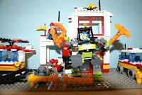
Overall me and Zac spent around 15 hours filming the Lego part of the work in the space of four days. The atmosphere for filming the Lego was very different to that of filming at Nunnery Wood High School as we never had a time limit and didn't need to move anywhere. We had already set the location up a few days before filming and carried out certain things that would make the filming run very smoothly. We blue tacked loose pieces of Lego together so the buildings would fall when filming, we moved all the lights in a position where very little shadow was cast and most importantly we practised a lot.

Lego filming

Apart from being long and tiring filming the Lego went very smoothly. We never encountered any problems at all as we had done so much planning. we took it in turns between using the SLR camera and moving the Lego.

Voice over- Once we had filmed all the Lego we needed we created a voice over. This took a day to plan and only an hour to do. When we had recorded the voice over we were ready to edit.

Sound effects- We borrowed some Cd's from the media department and also downloaded some free legal sound effects off decent websites.

Premiere Pro 2- With everything we needed now done we just had to put our work together. Using the useful tools on Premiere Pro we could play about and experiment with our work until we were happy. Putting our work together went better than expected and the video will be uploaded on Youtube and then the blog in the next few days.

Planning: Lego

When we started looking for Lego to buy on the Internet we encountered a major problem, when we typed Lego into google millions of results came up. We finally decided to use a online shopping site to buy the Lego as it is quick easy and professional. We used sites such as Ebay and Amazon.
When we were browsing on Ebay we found that when we typed in Lego 100-300 results came up and they were mainly just coloured bricks. We didn't know the location we wanted and wasn't sure whether to buy a bunch of bricks and make our setting or buy a setting already made. Another problem we discovered was because Ebay is a huge conglomerate you get thousands of people on it and most of them bid for the same item you want. This was very annoying as we were outbid on several occasions and sometimes we had to bid more than we wanted just to increase our chance or buying the item.


We then searched on Amazon. However Amazon had a more niche market and the prices where a lot more expensive than anticipated.

We also spoke to our parents asking if we had Lego but we found out they had thrown them away when we were younger. Zac e-mailed our old media teacher Kate Wolstenholme and asked her if she had any Lego as she has kids. Unfortunately she hardly had any and only had Star Wars characters which we didn't want as it wasn't the mise-en-scene we needed.

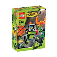
Finally we decided to look for Lego in shops in town like Argos and Entertainer. We found a decent villain in the Entertainer but it was expensive but we knew it would be cheaper than buying it online and it would save us time to get it now. It was a "power mining" Lego toy and cost £8 so we payed £4 each. There was one problem caused from this and that was the villain was green which meant we couldn't use the green screen card as they were the same colour and the villain would be erased out when putting in a background on the computer. We have now agreed to use blue screen for the time being.


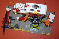
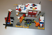
We continued to look on Ebay and eventually we found a "Fire mans" play set which had enough bricks and never had blue in it so it wouldn't contrast with the blue screen which is ideal. It also came with Lego people which we could use as they were basic. The cost was £15.97 which was around £8 each.
We still needed more Lego so we bought some bricks on Ebay as it was a instant buy. However we had to pay £15 for postage and delivery and some bricks were green and blue which was no use to us because we were using blue screen as a background.

Yesterday Zac was talking to one of his teachers and she said she had lots of Lego at home which she would let us borrow. Also she said if we borrow it can we sell the rest of the Lego we bought to her. This is great as we can make a profit and we now have most the Lego we need for filming. Zac plans to pick up the Lego next Friday at 11:30.

Below is the e-mail sent to Zac by his support teacher about the Lego:

Hi Zac I have heard that you are looking to source some original Lego for your filming. I have quite an assortment of bricks and models if you are interested. When you have finished with all your Lego it would be appreciated if I could have first refusal on purchasing it. Sue Wilson

Preparation for Lego filming

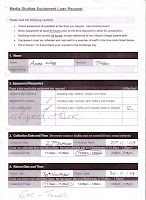
We booked out the lights for our filming on Friday the 27th. Zac pick the lights up at 12 50.

Zac took the lights home in his car as he passed his driving test in the summer holidays.

Green screen
Zac went to the arts shop in Worcester PHW on the high street and looked for colored card. He found there was loads of different colours, but eventually bought orange, silver and a light blue cards.

Orange
The orange was really bright but it did blend into the red too much. It also gave a very bad contrast to some of the lighter colours.


Silver
The colour silver worked very well. The shadow was limited to bar minimum and took most of it off straight away. The only colour that was like it was white however this worked well. Until we realised that the Lego character we used was silver/grey.Therefore this blended into the background.


Light blue
This worked well because the only colour blue we used was see-through dark blue. Which didn’t really affect the background. The shadow from this card did make a fair amount of shadow however this wasn't a problem with the high powered lights.


Logistic arguments

I and Zac agreed to meet at Elgar statue at 1 on Sunday the 29th of October.

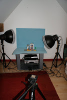
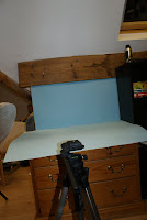
We set the lights up and placed the blue screen ready where we wanted it to be placed. We tested different places but found the best location was on a draw in the corner as there was no shadow when the lights shone on it. The format we used on the lights we found out that the shadow we got was behind most of the main area so we moved one of the main lights to the back taking the shadow off.


We found out Zac tri-pod was really unsteady and every shot we took was in a different position which didn’t help us so we have made arrangements with the technician Ian to borrow the lights on Thursday. Zac has managed to get a tri-pod that will stop the tilting of the camera. We hope to finish within the next week.

Saturday 17 October 2009

Planning our film in detail

Problems encountered
We meet on the Tuesday before half term as we needed to get a tape for our film as Zac and I forget to get one from the college. We went into town and discovered that you couldn’t buy a separate tape on its own so we had to buy a pack; the price was from £12-20. We looked in all the shops of high street media conglomerates such as Comet, Currys and Jessops. Zac was the one with the money and decided to get the Sony tapes which cost £12. This made our budget increase to £32.

Film diary 27 of October
We had all he logistic arrangements organised and I was at collage Jordon and the equipment. Zac arrived at collage at about 11.15 he had went into town to get the tape. When he arrived we went to see if any of the rooms were unlocked in the college so we could use them to but as expected the rooms where locked. We wanted our shots to be filmed in chronological order so then I decided we should use the library as it was open and there is an area at the back which is like a classroom. We had to ask for permission from the librarians but they were really nice and let us.

Battery
Just as we set everything out and were ready to film I realised that we only had one battery and it was very low on power. Zac spent 15 minutes looking for our media technician Ian who looks after all the equipment. In the end he found him but he didn’t have a key to the media room which had all the equipment in. While Ian went looking for a technician we had the chance to plan out what we were going to do and eventually Ian turned up with a spare battery for us. He also gave us a battery charger so I charged the dead one and used the other one so we could keep crossing over between the two batteries to get us through the day.
Finally we could start filming and we followed the storyboard step by step. We also came up with some new shots we didn’t include in the storyboard which we were pleased about. We Filmed every shot atleast five times from different angles so we could chose the best shot at the end. This was experience from which me and Zac had learnt last year from the chance of getting a jump shot,180 rule or having a bland range of shots if you only had one shot for each scene.
We knew where the janitor’s classroom was and when we were finished filming in the LRC we went to him and had had keys to open a classroom door for us as we needed it to film our next scene.

It took 4 hours to film everything we wanted and we ended up with 2 and a half minutes of film which we need to cut down to around 30 seconds. Overall I enjoyed filming and everything went according to plan apart from the battery issue which we eventually sorted out. Jordon was good and helped us a lot he even tried to come up with some of his own ideas!
We have now decided on the first Monday back we will scan all of work in like storyboards and pictures and upload them to the blog.

Friday 16 October 2009

More Planning

Story board


In the last week of collage between the 18-22 of October I agreed to meet up with Zac in a couple of our frees and put together a story board.

We have agreed that our character wakes up in an empty classroom in the college after permission from the janitors. We used shots like pan and long shots of the environment to show the new world the Main character has entered. The fact the main character is confusion is demonstrated by close ups and hand held camera shots which we agreed on using.
The last shot we came up with is the main character sat at a desk in a room with a voice over saying episode one with it written on a white board that is turned over to show the audience. This is going to change every week a different episode number and name.

Below is a shot list of the type of shots we are thinking of using and how long each shot will be:

Shot list

High angle long shot-2 seconds

High angle close up-1 second

Mid long shot-3 seconds

Point of view shot-4 seconds

Medium shot-3 seconds

Hand held/Depth of focus-5 seconds

Long shot-4 seconds

Long shot-5 seconds

Mid shot-2 seconds

Long shot-3 seconds

Hand held/pan 360-8 seconds

Long shot-3 seconds

Close up-2 seconds

Voice over planning
If everything goes according to plan when we finished filming the visual context in the half term we can upload the video and start editing. This is important as it gives some idea of how long we need to make the stop frame animation.

Before we do the voice over we will need to make a script.
However we have to wait until we’ve finished the editing and the stop frame animation to give us the duration of the editing sequence. We are hoping to get this done in brief in October so we can focus on the stop frame animation.

Thursday 15 October 2009

Planning: Letters and e-mails

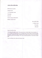
Letter to Mr and Mrs Wise

MR Zachary Jay Park
Himley House
112 Ombersley house
Worcester
Wr3 7EZ
Home number;01905 20270
Mobile: 07825212230
Mr and Mrs Wise
1 Coltishall close
Worcester
WR5 3RF

Dear Mr and Mrs Wise
I am writing this letter to ask if I may use your son Jordan Wise in the production of our TV Drama. We will contact you to arrange when we will need him and give dates and times. He will be the main character and will have to play a big role in the drama. However he will not be involved in any sort of antisocial behaviour and will be looked after.


Yours sincerely Aaron Wise and Zachary Park


The letter above has been sent to the parents of the actor asking if we can use him in the making of our Children's TV Drama. I will blog the reply we get.


LEA: Worcestershire
Telephone Number: 01905 354154
Fax Number: 01905 354154
Address: Prestwich Avenue Worcester
Post Code: WR5 1QE
MR Zachary Jay Park
Himley House
112 Ombersley house
Worcester
Wr3 7EZ
Home number;01905 20270
Mobile: 07825212230


Dear Mr/Mrs
We are writing Worcester sixth form A2 media students. Our media coursework is to develop and create the opening of a children’s TV drama. We are writing to ask if we can give out some questionnaires to your members of staff, which they could give out to the children to complete. We could then collect them from staff at the end of the day. The questionnaire is very simple and consists of questions like “when do you watch TV” and “what TV channels do you watch”. We would like to hand out 40 questionnaires but 10 to each year from year 3 to year 6. This is because that is our target audience for the making of the TV drama. We would really appreciate it if you take this idea on board and it would help us greatly to achieve our project. Hope this didn’t take up to much of your time and we look forward to hearing from you

Yours sincerely Zachary Jay Park and Aaron Gregory Wise, Media Sixth form students


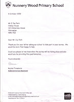
This letter has been sent to Nunnery Wood Primary School asking if we can give out questionnaires to the students there, which is our target audience as we want to get some direct feedback. I will also blog the reply we get.

Hello,
I am a media studies student at Worcester Sixth Form College. For my coursework this year me and my partner are making a Children's TV Drama. We would like to know if we can film on school site during half term. Not inside but outside on the playground. It would only take a day and would really help us complete our coursework. Sorry for taking up your time and I look forward from hearing from you.
Yours sincerely Aaron Wise

This is an e mail I've sent to Nunnery Wood High School asking if we can film on site during half term. I will blog the reply I get.

I and Zac spoke to the janitor to see if Worcester sixth form collage was open in the half term.
Here are the minutes of the convocation

Zac: hello

Janitor: hello, what can I do for you?

Aaron: we are looking to film our media coursework in the holidays and I was just wondering if the collage was open and if any rooms were.

Janitor: collage will be open every day from 9-5. If you’re looking to get into any rooms ask one of the janitors around collage or reception where you want to go.

Zac: alright thank you

With this in mind we now know the college is open in half term and we can use it for filming we
just need to figure out what day we are going to film on.


Wednesday 14 October 2009

Practising making our Drama #2

We are now at the stage where we are just eager to start filming. But we need more practise and with this in mind we attempted to make another Stop Motion Animation movie. It is crucial we get the practise so we are confident in our abilities when it comes to the real thing.

Things were very different this time round mainly because we had Lego. Also we booked the photography room where the actual filming of the Lego animation will take place. This has advantages as we will be able to set everything up much quicker as we've had practise. We used the same lights but this time we used four instead of three to get rid of all the shadows. We also used the same camera and method as last time round. However the filming took place on a small stage a few center metres above floor level so everything had to face downwards. We had to cover the floor and walls with green screen so we could change the background later on Adobe Premiere Pro 2.0. The same rules applied as last time, as Zack took the shots and I moved the Lego. It took just under an hour to film and was harder than last time as there was more objects to move and because they were so small they kept falling over which was a pain as we couldn't put it back in the exact position. In some shots I used blue tack to hold up certain objects that were flimsy this was good as you couldn't see the blue tack and it worked effectively. After filming and putting the movie on Adobe Premiere Pro 2.0 we could see there weren't as much problems but there was one main one. Firstly we still had the shadow problem but that was because there were several other people in the small room with us practising but obviously in the real thing we will be filming alone. Another small issue was you could see the green screen line going across the film. But again in the real thing we would tape this down so you wont see it. The big problem we had though, was the camera going in and out of focus. This wasn't Zack's fault as he didn't no, but we now realise that to avoid this we have to keep changing the camera focus every time an object moves towards or away from the camera to get a clear picture.

This is the link to the second practise we did:

http://www.youtube.com/watch?v=Ts85OZaZLW4

After practising for a second time I can see we have improved but also encountered new problems so we must be aware at all times if we want our Lego animation to be a success.
Overall I feel more and more confident with the more practise we do and I am looking forward to filming the real thing as it will be a new and exciting experience for us.

Practising making our Drama

Before we even start thinking about filming our Children's TV Drama we have to have some practise.
Today we practised using Stop Motion Animation for the first time which had some positives and negatives.
Firstly we set up a setting where the filming would take place using the back wall of our media class and green screen. This was easy to do but then we had to set up three lights all at different angles around the table. This took us a while but we have to be very careful with lighting equipment as you can get hurt using them inappropriately. After setting up the lighting equipment we got a Nikon D60 DSLR camera with a tripod and placed it a few centre metres from the table. Once we had every thing in place we needed something to film. We chose a remote used to work the whiteboard as we didn't have any Lego. When we placed the remote on the green screen and turned the lights and camera on we could see straight away there was a big problem. The remote had shadows all round it, this is a problem because when the film goes on Adobe Premiere Pro 2.0 and we replace the green screen for a background of our choice the shadows will still be there. So we had to play around with the lights a lot until we got rid of the shadows on the remote. Once we had done this we could begin to film, Zack took the pictures on the camera and I had to very slowly move the remote across the green screen after every shot he took. This took around 20 minutes to do a few seconds clip so you have to have a lot of patients. After doing this we had to follow the following instructions:

# Press the menu button on the back of the camera
# Press the down arrow, then OK to select "retouch" menu
# Press the down arrow again and OK to select the "stop motion movie" option
# Press OK to select "create movie"
# Select your starting and finishing image using directional arrows and the OK button
# Press OK to save, then OK again to preview

After viewing our short film we could see there were a few problems, such as:

1- Still shadows reflecting off the remote
2- Shadows of my reflection were in a few shots
3- remote being moved to fast and jump cuts were obvious
4- In one or two shots my hand was in the shot because the picture was taken to quickly

We have to learn from these mistakes and in our next practise we aim to avoid all of them. We can do this by taking our time when taking shots and the person moving the object should step a metre away from the setting so there shadow will not reflect off the lights.

We got rid of the frames we didn't want by selecting "edit" after viewing the film. We then removed the SD card from the camera and put it in a computer. We then opened up Adobe Premiere Pro 2.0 where we selected file then import to get our animation which had a .avi file in drive "p".

Once we did this we could experiment with the tools on the software. We removed the shadows using the fade tool and then turned the green screen red by selecting colour background.

Overall we have had a lot of fun using Stop Motion Animation and have learnt a lot like how we will avoid the mistakes we've made and how we are going to use this in our Children's TV Drama. In my next blog post I will be talking about how we did this again but with Lego.

This is the link to our first practise using Stop Motion Animation:

http://www.youtube.com/watch?v=znJDznjrM0w

Am I a Auteur?

After looking at Redundancy and Entropy we started to look at "Auteur's" and there influence on other real media texts. In this blog post I will be understanding the meaning "Auteur" and seeing if I myself am a "Auteur".

French Film directors in the 1950s like Francois Truffaut advocated a focus on the contribution made by the director on the style and from of a film. This is in direct contrast with other perspectives on film which advocate looking at how the film develops as part of a generic history. Also auteur theory differs to "Genre theory" in that it points our attention towards what is different between films, rather than what is similar. Clearly many media texts are meant to be considered as products of individual creativity and many are simply "products".

Genre Theory focuses on:
# Generic similarities
# How texts are determined by historical/social/political contexts
# How texts emerge as commercial products from an industry

Auteur Theory focuses on:
# Individual stylistic features
# How texts are determined by artists creativity
# How texts emerge as part of an artists body of work

Looking back at my AS coursework I can see it was very generic as I wanted to use a lot of conventions from real media texts. However this year I still think my work is generic in some ways as I've looked at conventions from real media texts, but I also have put my on unique twists in.
This year my work is very original as me and my partner are thinking up new ideas which haven't been used before. Just like in my coursework last year we followed a simple plot then shocked the audience by throwing in a twist at the end. This year the same idea applies as I am a person who likes to shock the audience when watching something generic.
Therefore I believe I am an "Auteur" as I like to use my own ideas my work. Looking at the idea of "Auteur's" has been interesting and has given me ideas of how we could develop our idea even further.